
Cumulus
Summary
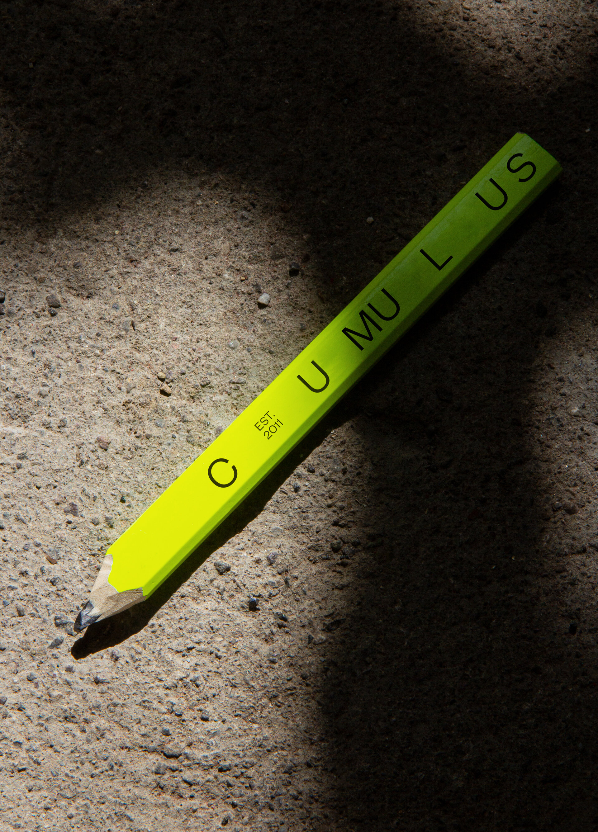
Cumulus is an architecture studio comprising 35 architects, designers and planners. Working collaboratively across offices in Hobart, Launceston, Melbourne and Adelaide, they’ve gained a reputation for progressive design and adaptive reuse. The new identity speaks to the ever-changing cloud of ideas, and the cumulative, collective conversations between design and the environment. The visual identity adapts to its environment, with a word-mark that is in constant flux, and typographic word clouds that communicate the core ideas of projects — all under-pinned by a horizontal grid system inspired by cloud altitudes.
Brief
Cumulus was fast gaining a reputation for their award-winning architecture. However, their brand did not accurately represent their ambition. Although in high demand, Cumulus understood that in an increasingly competitive design landscape, they needed a brand that was representative of who they were and the work they do — something for the entire studio to rally behind.


Solution
The new identity speaks to the ever-changing cloud of ideas, and the cumulative, collective conversations between design and the environment. The visual identity adapts to its environment, with a word-mark that is in constant flux and typographic word clouds that communicate the core ideas of projects. Under-pinning the identity is a strict horizontal grid, inspired by cloud altitudes.


Cultural context
Although highly regarded within the industry, Cumulus felt like their brand didn’t accurately portray their reputation. They needed a new identity that galvanised staff working across four offices, was clean and simple to use, and felt modern and progressive. The brand therefore was designed within a familiar architectural lexicon, with systems that would allow easy application and variation.


