City of Launceston
Helping define a near-undefinable city.
Once you step foot in Launceston, you sense there’s more to the city than meets the eye. Behind the historic architecture and industry, weathered landscapes and heritage-listed gorges, rolling farmlands and waterways, 40,000 year old palawa/Tasmanian Aboriginal culture and close-knit communities, you will discover a city where locals won’t just stop to show you the way — they’ll stop to show you around.
Long considered Tasmania’s second city, or “the gateway to the north”, Launnie’s identity has been forged by its remoteness. Despite their proud independence, the city knew it needed a new place brand to overcome stereotypes and re-write historical challenges (including reintegrating the palawa people into the city’s story), to better represent the way Launnie saw itself — and the way the world saw Launceston.
Place Branding Brand Strategy Brand Identity Brand Voice Illustration Community Engagement Place Immersion Environmental Design


Life in The Undercurrent
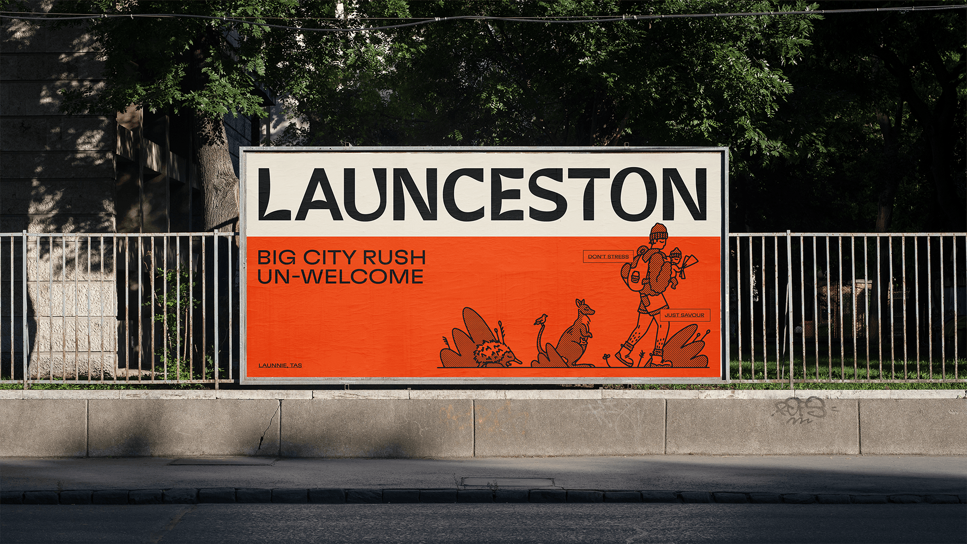
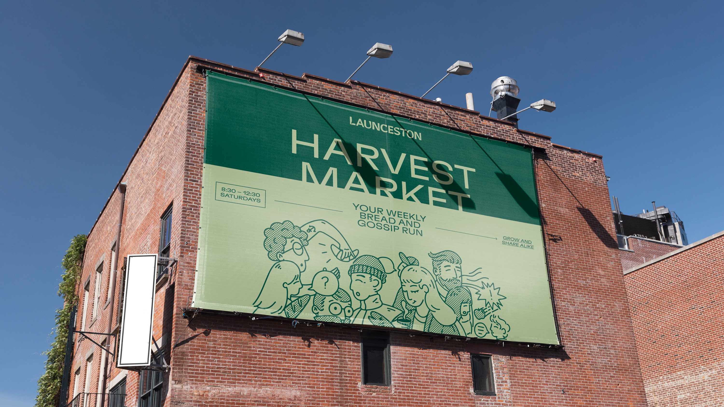
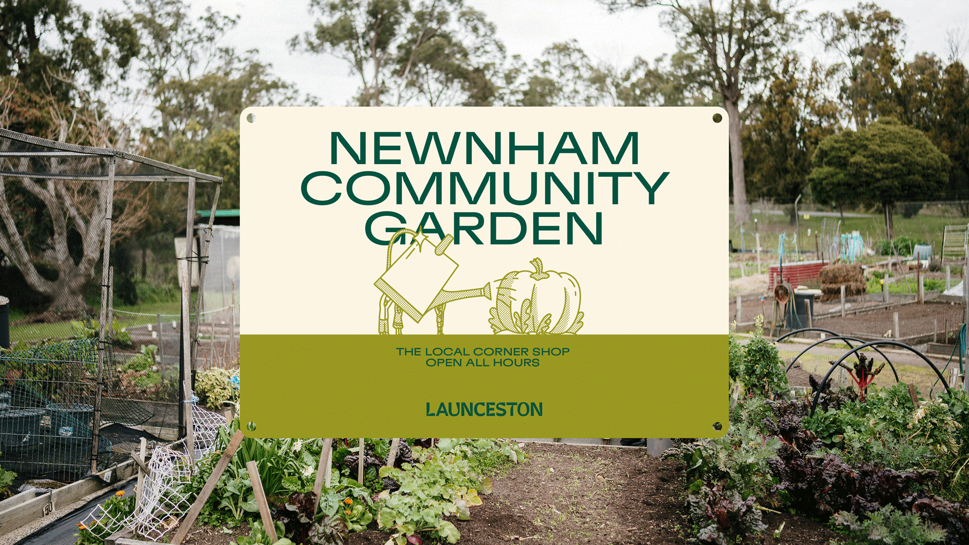
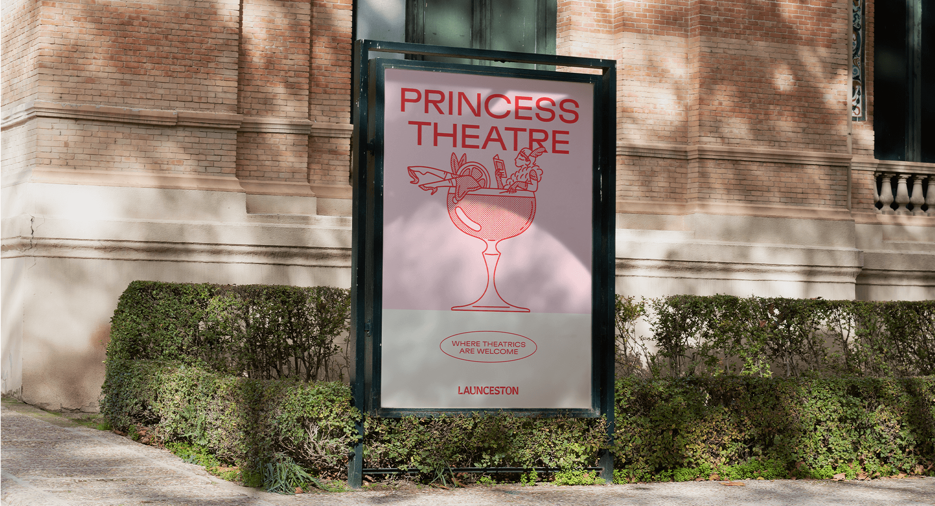
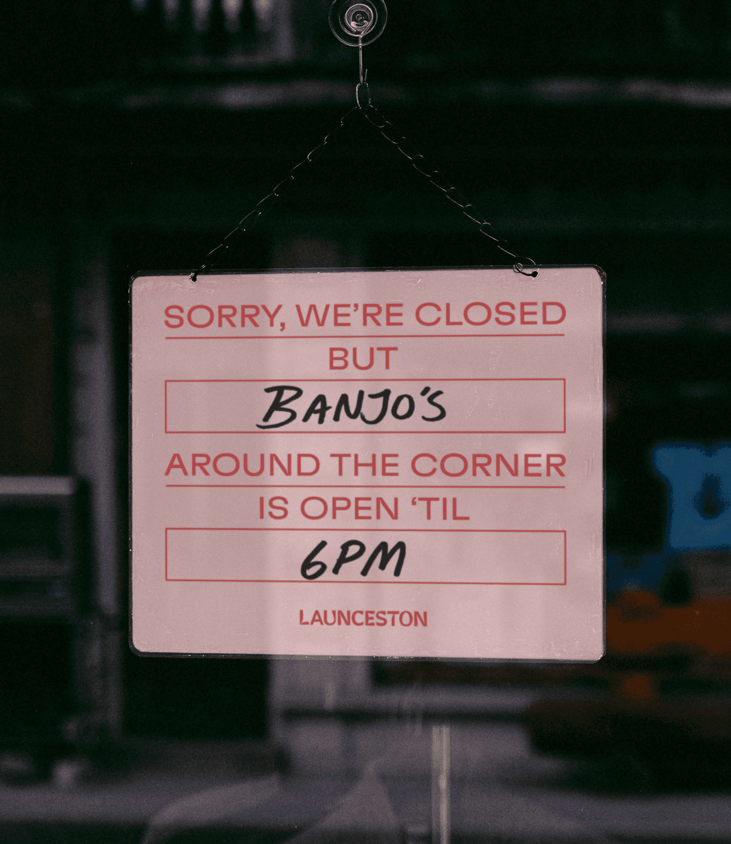
To do this, we invited audiences in to discover and experience the city in the best way possible — like a local. The brand idea, ‘The Undercurrent’, transforms the laid-back locals into storytellers and guides, delving beneath the surface to reveal the secret “goings on” that often go unseen. What we unearth is a city that does things in its own way, at its own pace — a poster city for the slow-city movement, where a traffic jam is lining up for a coffee at the farmers’ markets on a Saturday morning, and big city pressure is trying to wrap up a chat on the street. The new identity captures the quirks and hints at the eclectic, laid-back nature of the city. The wordmark reflects the estuary and the banks of the two rivers; illustrations show charming, offbeat characters navigating local scenes; photography captures real moments from a local perspective; and language channels the local voice—playfully juxtaposing big-city expectations with the unexpected stories from the undercurrent.
Life in The Undercurrent
To do this, we invited audiences in to discover and experience the city in the best way possible — like a local. The brand idea, ‘The Undercurrent’, transforms the laid-back locals into storytellers and guides, delving beneath the surface to reveal the secret “goings on” that often go unseen. What we unearth is a city that does things in its own way, at its own pace — a poster city for the slow-city movement, where a traffic jam is lining up for a coffee at the farmers’ markets on a Saturday morning, and big city pressure is trying to wrap up a chat on the street. The new identity captures the quirks and hints at the eclectic, laid-back nature of the city. The wordmark reflects the estuary and the banks of the two rivers; illustrations show charming, offbeat characters navigating local scenes; photography captures real moments from a local perspective; and language channels the local voice—playfully juxtaposing big-city expectations with the unexpected stories from the undercurrent.


Owned by locals
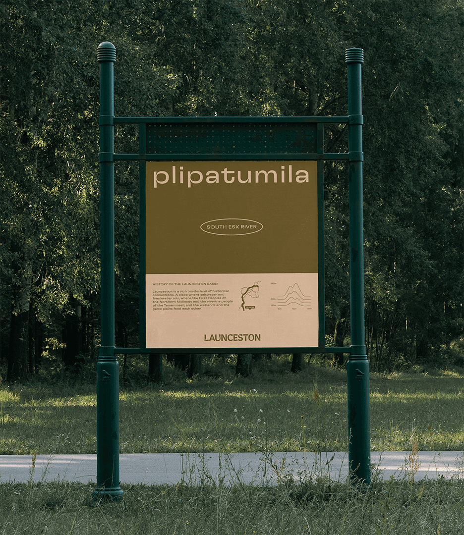
To build a meaningful regional brand requires a thorough engagement with the people that call it home. We worked closely with community groups, small businesses, and the Launceston City Council to shape a brand designed by the community — that spoke for the whole community. This is why we prioritised extensive consultation with the local palawa people. From exploring the rich history of the palawa kani language to listening to the insights of elders, we approached these conversations with care, respect, and a willingness to learn, taking on the role of moderator when necessary to ensure that the community's needs were fully represented.
Owned by locals
To build a meaningful regional brand requires a thorough engagement with the people that call it home. We worked closely with community groups, small businesses, and the Launceston City Council to shape a brand designed by the community — that spoke for the whole community. This is why we prioritised extensive consultation with the local palawa people. From exploring the rich history of the palawa kani language to listening to the insights of elders, we approached these conversations with care, respect, and a willingness to learn, taking on the role of moderator when necessary to ensure that the community's needs were fully represented.


“The Launceston Place Brand was created with the community to celebrate our distinctive story and spark pride. The brand will empower anyone with an interest in Launceston's future to talk about their city and tell their stories: artists, makers, growers, thinkers, do'ers are invited to step into the spotlight and share their tale.”
— City of Launceston

Credits
Recognition
A big thank you to Angie, Claire and the whole team at the City of Launceston — we appreciate you showing us Launnie's undercurrent, its un-capital-ness, and its undying charm.
Strategy
Damian Borchok, Sammy Page
Storytelling
Daniel St Vincent
Design
Jason Little, Jo Roca, Mel Baillache, Nicola Ferry, Liv King, Emma Turney, Georgia Urie, Atsaya Gabiryalpillai, Dash O’Brien-Georgeson, Kimberly Luo
Account
Alice Child, Alice Keeble
Illustration
Dash O’Brien-Georgeson
Wordmark Typography
Mathieu Reguer
Typeface
GT Flexa – Grilli Type
Awards
AGDA
Awards
Merit – Branding (Large Business)
Best Design Awards
Bronze – Large Brand IdentityFurther Reading
Field Notes
A big thank you to Angie, Claire and the whole team at the City of Launceston — we appreciate you showing us Launnie's undercurrent, its un-capital-ness, and its undying charm.
Strategy
Damian Borchok, Sammy Page
Storytelling
Daniel St Vincent
Design
Jason Little, Jo Roca, Mel Baillache, Nicola Ferry, Liv King, Emma Turney, Georgia Urie, Atsaya Gabiryalpillai, Dash O’Brien-Georgeson, Kimberly Luo
Account
Alice Child, Alice Keeble
Illustration
Dash O’Brien-Georgeson
Wordmark Typography
Mathieu Reguer
Typeface
GT Flexa – Grilli Type
Recognition
Awards
AGDA
Awards
Merit – Branding (Large Business)
Best Design Awards
Bronze – Large Brand IdentityFurther Reading
Field Notes
Credits
Recognition
A big thank you to Angie, Claire and the whole team at the City of Launceston — we appreciate you showing us Launnie's undercurrent, its un-capital-ness, and its undying charm.
Strategy
Damian Borchok, Sammy Page
Storytelling
Daniel St Vincent
Design
Jason Little, Jo Roca, Mel Baillache, Nicola Ferry, Liv King, Emma Turney, Georgia Urie, Atsaya Gabiryalpillai, Dash O’Brien-Georgeson, Kimberly Luo
Account
Alice Child, Alice Keeble
Illustration
Dash O’Brien-Georgeson
Wordmark Typography
Mathieu Reguer
Typeface
GT Flexa – Grilli Type
Awards
AGDA
Awards
Merit – Branding (Large Business)
Best Design Awards
Bronze – Large Brand IdentityFurther Reading
Field Notes
Acknowledgement of Country
The For The People team are spread across the world – but the majority of us currently live on the land known most commonly today as “Australia”. This land has been home to designers, artists, storytellers and planners for tens-of-thousands of years – so our time contributing to these crafts constitutes only a near-infinitesimally small fraction of that history. It’s with profound admiration and deep respect, then, that we acknowledge Aboriginal and Torres Strait Islander peoples as the First Peoples of this country and extend that respect to Elders past and present. They shaped (and continue to shape) the history of this land, they cared for (and continue to care for) its natural environment, and they never ceded its sovereignty. It always was, and always will be, Aboriginal land.
Acknowledgement of Diversity
All fields are improved by diversity – but that's especially true for creativity. We welcome everyone – the neurodiverse, members of the LGBTQI+ community, all (legal working) ages, all ethnicities, all genders, parents, those from unconvential educational backgrounds, people with disability – because we believe both our work and our workplace are improved by diversity of thought and perspective, which can only truly come from diversity of culture and experience. Having said that, we also know we can't simply reap the benefits of diversity without reckoning with the inequities so often suffered by less represented communities. We work to be mindful of our biases, to incorporate proactive representation into our processes, and elevate marginalised voices in our work. It's a forever-ongoing–and–improving process – but it's non-negotiable when you're building an agency that's For The People.
Designed and built by For the People ©2025
Acknowledgement of Country
The For The People team are spread across the world – but the majority of us currently live on the land known most commonly today as “Australia”. This land has been home to designers, artists, storytellers and planners for tens-of-thousands of years – so our time contributing to these crafts constitutes only a near-infinitesimally small fraction of that history. It’s with profound admiration and deep respect, then, that we acknowledge Aboriginal and Torres Strait Islander peoples as the First Peoples of this country and extend that respect to Elders past and present. They shaped (and continue to shape) the history of this land, they cared for (and continue to care for) its natural environment, and they never ceded its sovereignty. It always was, and always will be, Aboriginal land.
Acknowledgement of Diversity
All fields are improved by diversity – but that's especially true for creativity. We welcome everyone – the neurodiverse, members of the LGBTQI+ community, all (legal working) ages, all ethnicities, all genders, parents, those from unconvential educational backgrounds, people with disability – because we believe both our work and our workplace are improved by diversity of thought and perspective, which can only truly come from diversity of culture and experience. Having said that, we also know we can't simply reap the benefits of diversity without reckoning with the inequities so often suffered by less represented communities. We work to be mindful of our biases, to incorporate proactive representation into our processes, and elevate marginalised voices in our work. It's a forever-ongoing–and–improving process – but it's non-negotiable when you're building an agency that's For The People.
Designed and built by For the People ©2025