Equator
Changing the travel industry, for good.
People want to make sustainable choices when they travel. But knowing what those choices are has become difficult for tourism operators and overwhelming for tourists. Between the costly reports, carbon calculations and climate certifications, being sustainable can seem more like a sacrifice — something that compromises your experience, or complicates your plans.
Equator is charting a new course in sustainability consulting, with a platform that translates hundreds of data points into actionable insights, specifically tailored to your trip. They needed an identity that would take them from tech start-up to data disruptor and capture their ambition to change the industry, for good.
Travel Brand Strategy Brand Identity Brand Voice Sustainability


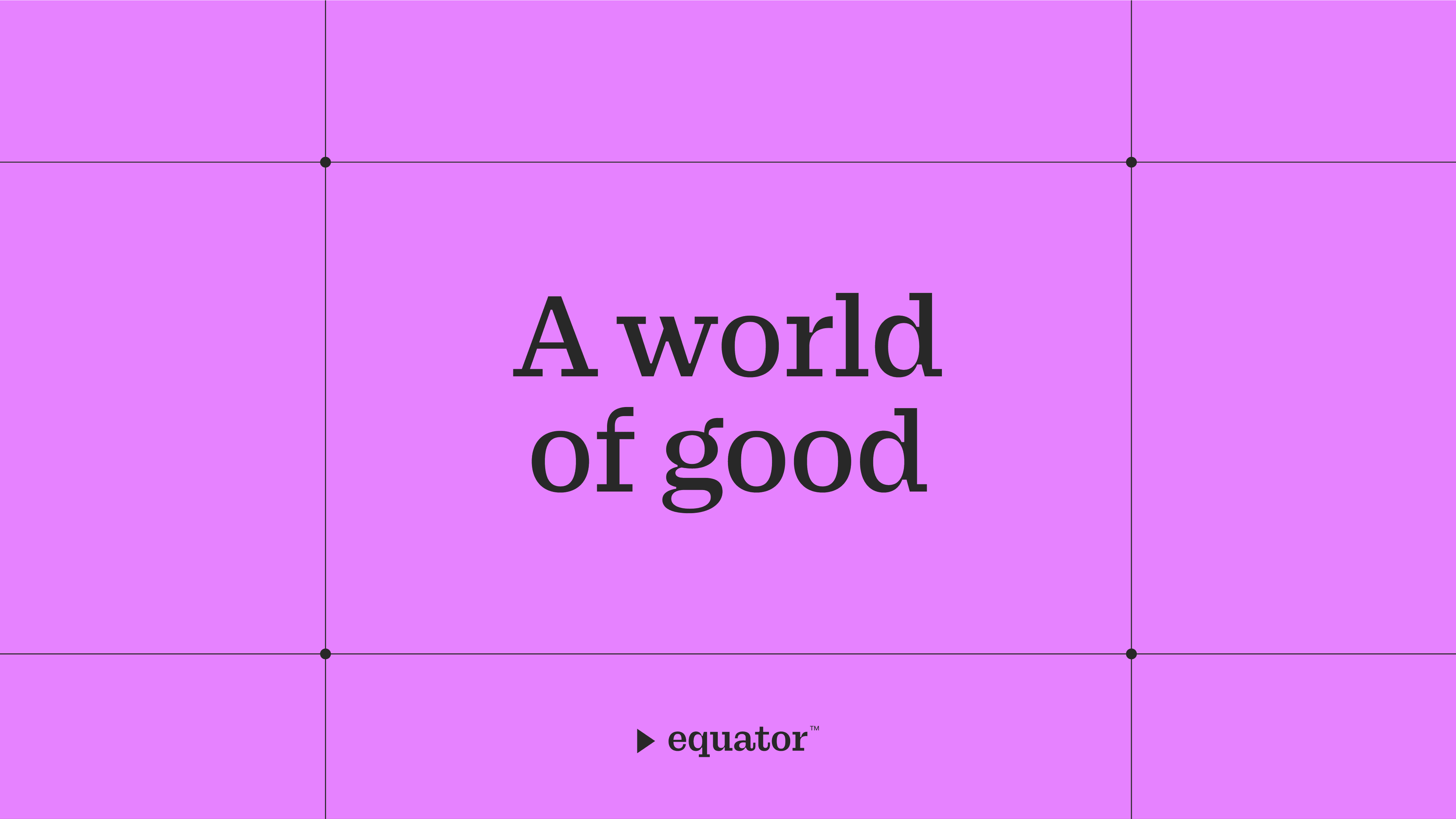
A world of good
Sustainable travel doesn’t have to be restrictive. Whether it’s eating lobster with Icelandic locals, trekking through the remote regions of Nepal, or cycling around the streets Denmark — exploring the world can do a world of good. We positioned Equator as the ultimate sustainable travel guide, bringing together data from every destination to improve the impact (and overall experience) of your trip.


The new identity invites you to explore an expansive world of data, with Equator as your guide.
The new identity invites you to explore an expansive world of data, with Equator as your guide.
The new identity invites you to explore an expansive world of data, with Equator as your guide.
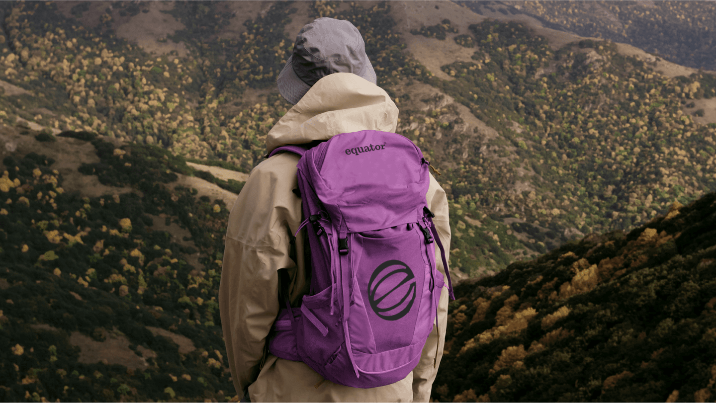
Your sustainable travel guide
The new identity invites you to explore an expansive world of data, with Equator as your guide. Its gridded system is made up of infinite data points, with navigational tags and expressive icons signposting the way forward. Bright highlight colours and spotlighted stories bring personality to the world of consulting, combined with a brand voice that serves as your helpful translator and friendly guide.

Using the name as a starting point, the new logo follows the equator line and the Earth’s axial tilt, creating a globe with a distinctive ‘e’ shape. In motion, it mirrors the constant rotation of the earth, scanning and sorting through a world of data to find experiences that do a world of good.
Using the name as a starting point, the new logo follows the equator line and the Earth’s axial tilt, creating a globe with a distinctive ‘e’ shape. In motion, it mirrors the constant rotation of the earth, scanning and sorting through a world of data to find experiences that do a world of good.
Using the name as a starting point, the new logo follows the equator line and the Earth’s axial tilt, creating a globe with a distinctive ‘e’ shape. In motion, it mirrors the constant rotation of the earth, scanning and sorting through a world of data to find experiences that do a world of good.
“The brand is now a massive differentiator in this space. We went aggressively orchid pink. The voice is the antithesis of every sustainability company out there. It resonates and it lasts with clients now.”
— Edmund Morris, Founder
“The brand is now a massive differentiator in this space. We went aggressively orchid pink. The voice is the antithesis of every sustainability company out there. It resonates and it lasts with clients now.”
— Edmund Morris, Founder
“The brand is now a massive differentiator in this space. We went aggressively orchid pink. The voice is the antithesis of every sustainability company out there. It resonates and it lasts with clients now.”
— Edmund Morris, Founder
Credits
Recognition
A big thank you to Edmund Morris and Maya Huneidi, who were insightful and thoughtful tour guides during our foray into sustainable travel.
We appreciate them letting us tag along for a leg of their never-ending journey.
Strategy
Claudia Henderson
Storytelling
Arielle Bodenstein, Mat Groom
Design
Nicola Ferry, Atsaya Gabiryalpillai
Account
Mabel Tu
Typefaces
Stakkat – Studio René Bieder
Azeret – Displaay Type Foundry
Awards
D&AD
Awards
Shortlist – Logos in Branding
AGDA
Awards
Distinction – Branding Small Business
Distinction – Logos, Trademarks & Symbols
A big thank you to Edmund Morris and Maya Huneidi, who were insightful and thoughtful tour guides during our foray into sustainable travel.
We appreciate them letting us tag along for a leg of their never-ending journey.
Strategy
Claudia Henderson
Storytelling
Arielle Bodenstein, Mat Groom
Design
Nicola Ferry, Atsaya Gabiryalpillai
Account
Mabel Tu
Typefaces
Stakkat – Studio René Bieder
Azeret – Displaay Type Foundry
Recognition
Awards
D&AD
Awards
Shortlist – Logos in Branding
AGDA
Awards
Distinction – Branding Small Business
Distinction – Logos, Trademarks & Symbols
Acknowledgement of Country
The For The People team are spread across the world – but the majority of us currently live on the land known most commonly today as “Australia”. This land has been home to designers, artists, storytellers and planners for tens-of-thousands of years – so our time contributing to these crafts constitutes only a near-infinitesimally small fraction of that history. It’s with profound admiration and deep respect, then, that we acknowledge Aboriginal and Torres Strait Islander peoples as the First Peoples of this country and extend that respect to Elders past and present. They shaped (and continue to shape) the history of this land, they cared for (and continue to care for) its natural environment, and they never ceded its sovereignty. It always was, and always will be, Aboriginal land.
Acknowledgement of Diversity
All fields are improved by diversity – but that's especially true for creativity. We welcome everyone – the neurodiverse, members of the LGBTQI+ community, all (legal working) ages, all ethnicities, all genders, parents, those from unconvential educational backgrounds, people with disability – because we believe both our work and our workplace are improved by diversity of thought and perspective, which can only truly come from diversity of culture and experience. Having said that, we also know we can't simply reap the benefits of diversity without reckoning with the inequities so often suffered by less represented communities. We work to be mindful of our biases, to incorporate proactive representation into our processes, and elevate marginalised voices in our work. It's a forever-ongoing–and–improving process – but it's non-negotiable when you're building an agency that's For The People.
Designed and built by For the People ©2025
Acknowledgement of Country
The For The People team are spread across the world – but the majority of us currently live on the land known most commonly today as “Australia”. This land has been home to designers, artists, storytellers and planners for tens-of-thousands of years – so our time contributing to these crafts constitutes only a near-infinitesimally small fraction of that history. It’s with profound admiration and deep respect, then, that we acknowledge Aboriginal and Torres Strait Islander peoples as the First Peoples of this country and extend that respect to Elders past and present. They shaped (and continue to shape) the history of this land, they cared for (and continue to care for) its natural environment, and they never ceded its sovereignty. It always was, and always will be, Aboriginal land.
Acknowledgement of Diversity