
City of Sydney
Background
Sydney is a vibrant, cosmopolitan city with a diverse population featuring a rich history, internationally-recognised tourist attractions and an exciting calendar of events. The City of Sydney is the local government authority responsible for the city centre and more than 30 suburbs within our boundaries. They provide services for more than 200,000 residents and 20,000 businesses — as well as the daily influx of workers and visitors into the city. On any given day, the local population swells to more than 1 million, with people commuting, doing business, shopping, playing, studying, or sightseeing. Their brand serves them all.


Challenge
Our challenge was to unify all of their communications into a one coherent brand, and unite all of the departments into a master-brand approach for their organisation. A key criteria was to overhaul the visual identity whilst keeping and evolving the city’s logo. We needed to rationalise the brand into a simple, easy to use system the could be work across a broad array of uses and needs. It needed to be intuitive and enable in-house teams and creative partners to thrive.


Approach
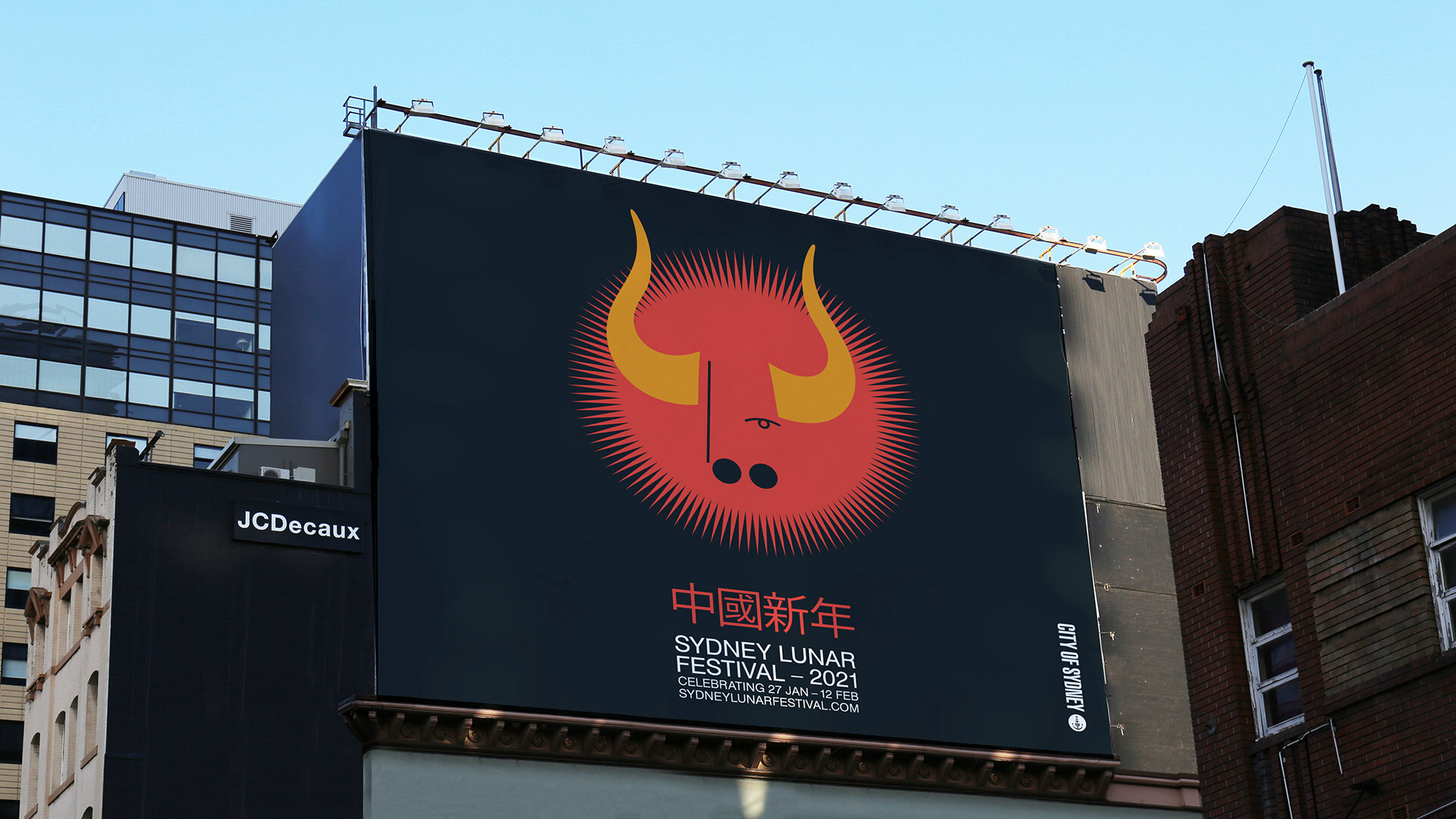
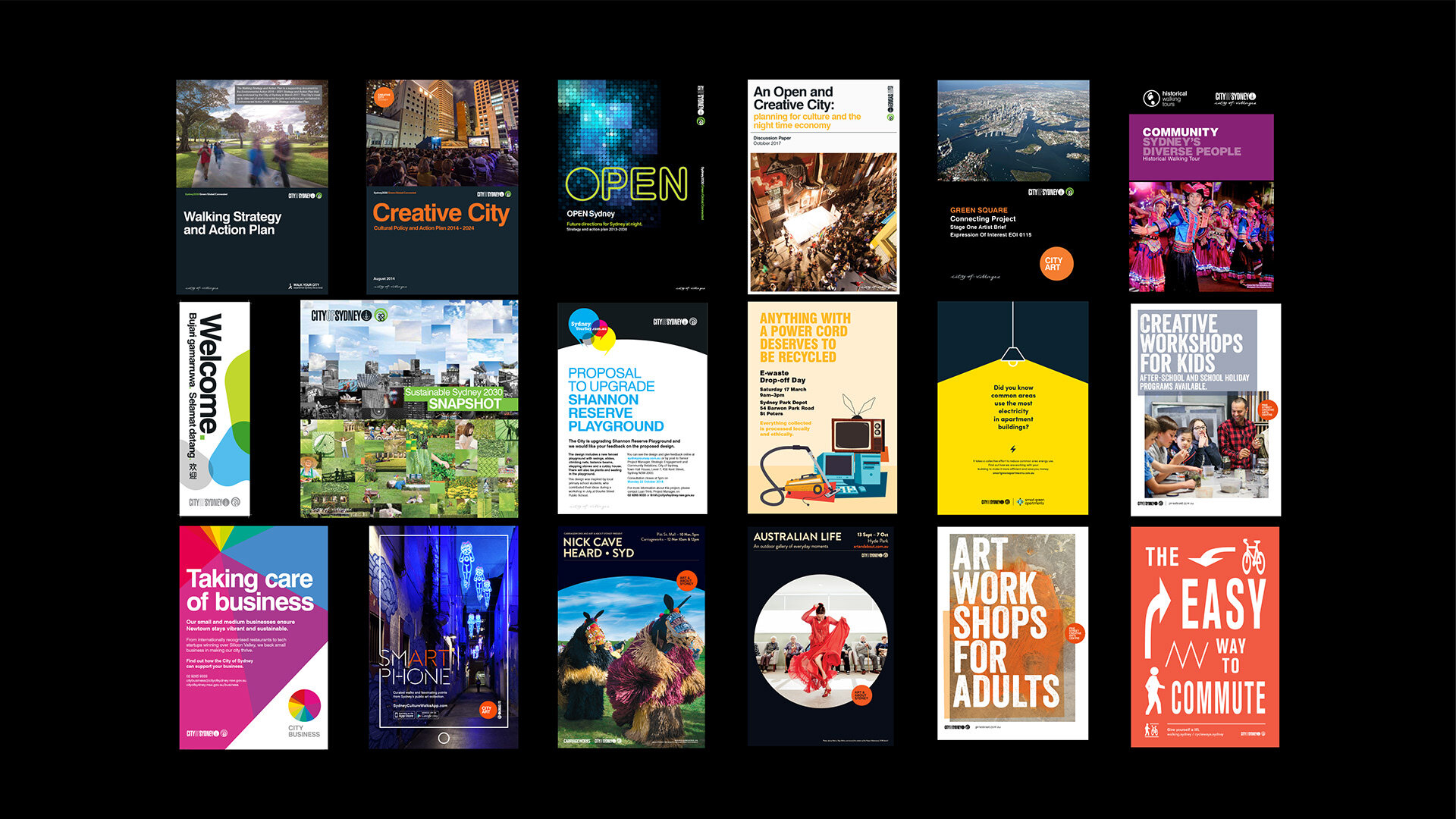
Based on a core and flex model, the identity relies on a suite of core elements for the majority of applications, whilst being able to flex for special occasions. The city has worked with numerous design studios in the past, so there were plenty of examples of event and sub-brand design that leant on geometric foundations due to the nature of the city’s circular logo. We built the holistic identity system on this foundation of geometry and circle DNA. Once adopted, a high degree of flexibility was introduced to ensure the council could maintain a world-class communications strategy that captured the essence of the city.


Stakeholder engagement
It can be very difficult for public governmental organisations to make wholesale changes to their identities without generating public frustration regarding expenditure. Shifting to a master-brand strategy would drive positive perception and equity to the organisation, and help reduce the costs involved with managing the large number of sub-brands. Internally, the removal of sub-brands would potentially cause people and departments to feel like they were losing their own identity within a large organisation. Therefore, a key challenge was to make significant changes without drawing attention to them, to facilitate a seamless transition. By keeping the project as collaborative as possible, we were able to ensure buy-in and uptake by the broader organisation.


Flexible systems
Building an easy system for others to use is a key outcome when we’re designing for organisations. We had to ensure there is enough flexibility built into the identity to create greater engagement, and encourage a more joyful experience by the teams using the brand – without feeling constrained by overly rigid guidelines and templates.

Typeface
City of Sydney has used Swiss 721 as their brand typeface for a decade, appearing across the city on collateral, advertising and signage. Whilst this wasn't something we could change without excessive cost implications, we were able to introduce a custom dot display font, developed with typographer Dave Coleman. The characters integrate the circle DNA with the Swiss 721 letter construction, to create a typeface that pairs seamlessly with their brand font.


Illustration
The illustration style spectrum was a key method of ensuring a coherent identity for the organisation whilst ensuring maximum room to play. The City of Sydney has always been at the forefront of creative collaborations, and we wanted to ensure this continued on well into the future. The circle DNA is goes from overt to subtle as the brand moves from core communications and materials through to events, where the designs can be more far more expressive whilst still maintaining the identity geometry DNA.

Credits
Illustration – Ilana Bodenstein
Dot Typeface – Dave Coleman
Related projects

NSW Government

Tech Central
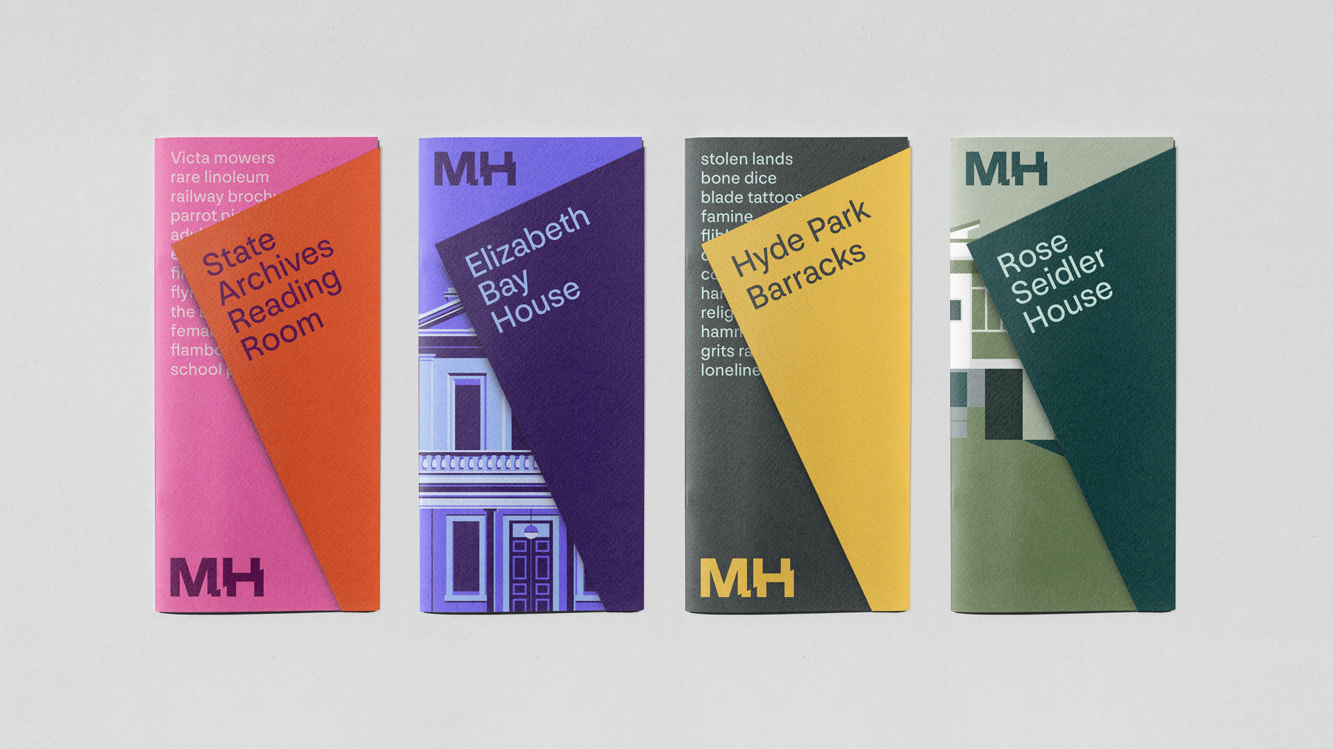
Museums of History NSW